Kitchen Colours 2026: What's In This Year?
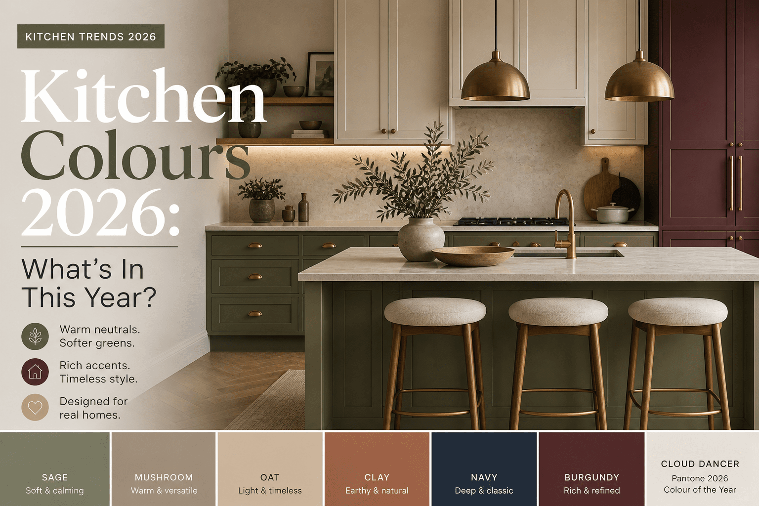
Kitchen colours in 2026 are all about warmth and longevity. The single most popular colour? Soft, muted greens — sage, olive, and eucalyptus — paired with warm neutrals like taupe and mushroom. These earthy tones are replacing the stark whites and cool greys of previous years, creating spaces that feel inviting and grounded rather than clinical. If you're not ready for colour, Pantone's 2026 Colour of the Year, Cloud Dancer, offers a creamy warm white that bridges the gap beautifully. The trend isn't about chasing what's flashy — it's about choosing colours that feel calm, work with natural light, and won't date in two years.
Choosing a kitchen colour is one of the most permanent decisions in a renovation. Get it right and it sets the tone of your entire home. Get it wrong — or chase a trend that dates within two years — and you're stuck with it.
As an interior designer specialising in kitchen and open-plan design, I see the same mistakes made repeatedly: making colour decisions based on assumptions rather than what the industry is actually doing. So this article is grounded in research — drawing on Howdens' 2026 trend report, John Lewis of Hungerford's 2026 colour guide, Ideal Home, and Pantone's 2026 Colour of the Year — to tell you what is genuinely happening in kitchens right now.
The clearest message from 2026 is this: warmth has replaced clinical minimalism. Cool whites and cold greys are stepping back. Earthy neutrals, softer greens, and deep, rich accent tones are stepping forward.
The End of the All-White Kitchen
The all-white kitchen isn't dead — but its dominance is definitively over. Howdens confirms that warm neutrals such as sandstone, porcelain, and sand greys are replacing the stark, clinical whites that defined kitchens for the past decade.
Pantone's 2026 Colour of the Year, Cloud Dancer, captures the direction well. Described as a "billowy white imbued with a feeling of serenity", it is soft, warm and airy — deliberately distinct from the cold, hard white of a showroom finish. It reflects natural daylight without the harshness.
If you still want a light kitchen, the move is towards these warmer, more grounded whites — not the brightest shade on the paint chart.
Warm Neutrals: The Kitchen Colour Story of 2026
If there is one clear direction for kitchen colours in 2026, it is warm neutrals. John Lewis of Hungerford's 2026 trend report identifies taupe, mushroom, stone, oat and clay as the colours becoming staples of kitchen design this year, noting that they create spaces that feel grounded, timeless and welcoming.
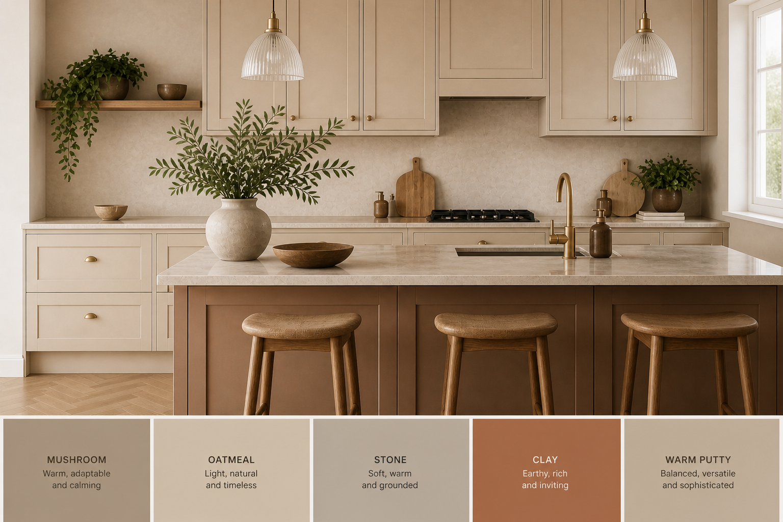
Rehome's 2026 expert colour guide, drawing on multiple interior designers, echoes this precisely: warm neutrals are the base layer of 2026 kitchens because they are flattering in real-life UK lighting and won't date quickly. Shannon Taylor of Lakeland Furniture names clay, olive, and soft mushroom as the core earthy palette.
Cool grey — the safe default of the 2010s — is now fading. The greys that work in 2026 are warm-toned: greige with yellow or pink undertones, stone with warmth in it. Anything cold and blue-based is looking increasingly like a dated choice.
Shades worth exploring:
• Mushroom and taupe — adaptable, flattering in most UK lighting conditions
• Oatmeal and stone — grounded, pairs cleanly with timber and brass
• Clay — slightly earthier, works well as an island or lower cabinet tone
• Warm putty — sits between beige and grey, more versatile than either
Greens in 2026: Softer, Not Darker
Green has been the dominant kitchen colour story for several years. In 2026, the direction shifts — not away from green, but towards softer, more muted, earthier variants. Forest green and deep racing green, which dominated kitchen trends in 2022–2024, are now considered overused.
Ideal Home notes that dark forest greens are officially stepping back in 2026, replaced by softer tones that sit more quietly in the space. The greens gaining ground are sage, olive, eucalyptus and moss — shades that create calm rather than make a statement.
Multiple designers quoted in research agree. Lauren Saab describes the direction well: tones that lean slightly grey or olive read more elevated than anything overly bright, creating a calm backdrop in a kitchen that is used all day.
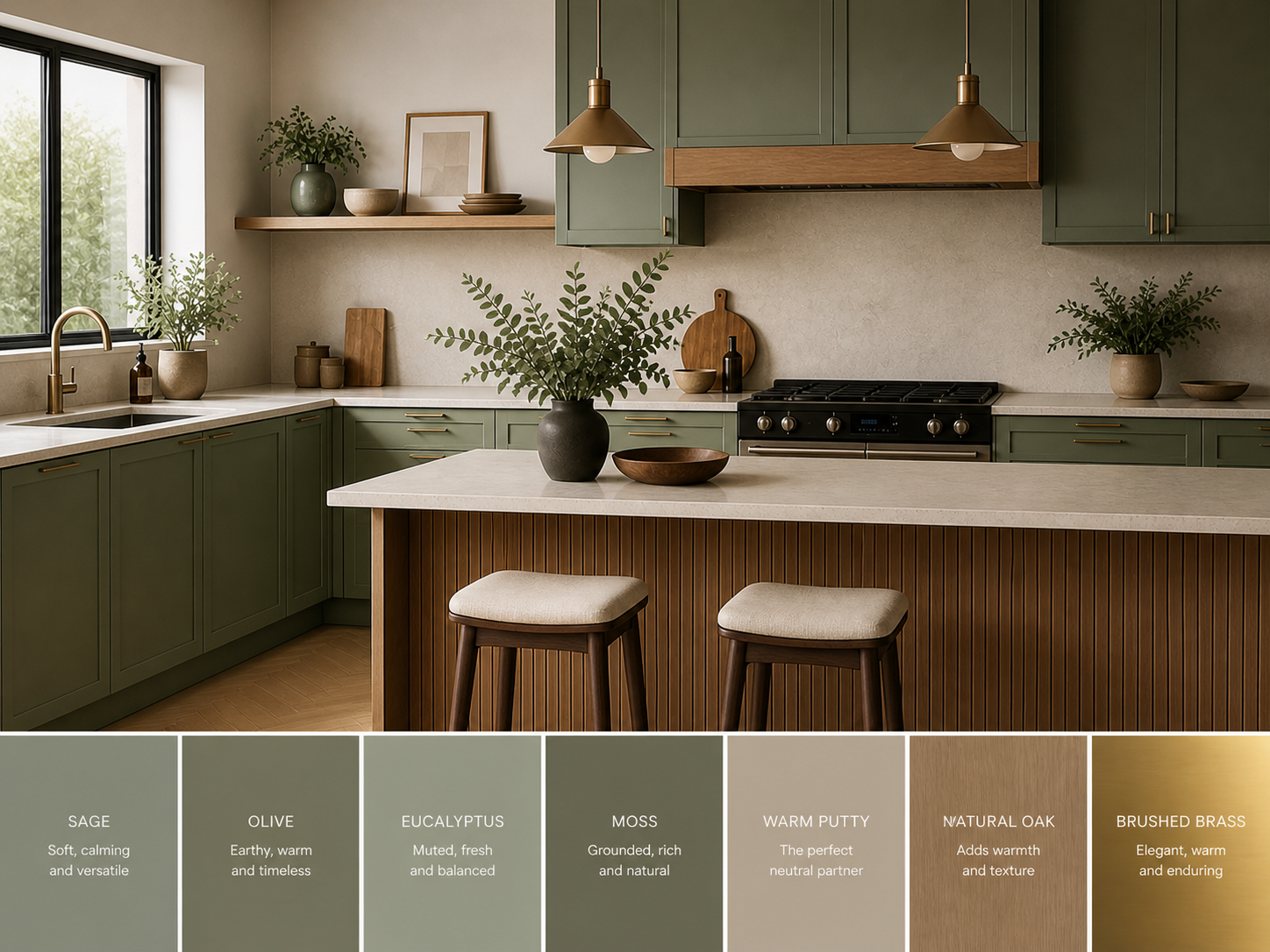
Olive and sage are transitioning from trend to timeless — particularly when paired with warm timber, stone-look worktops, and brushed metal hardware. They work especially well in open-plan kitchens because they feel calm rather than demanding when seen from the living area.
If you are planning an open-plan layout and thinking about how colour reads across the whole space, our guide on how to layout an open floor plan covers how to approach colour zones effectively.
Deep, Moody Colours: How to Use Them Well
Rich, dark tones are a clear strand in 2026 kitchen colour trends — but they have evolved. John Lewis of Hungerford describes deep reds and burgundy as stepping boldly into kitchen design this year — but crucially, they are brown-based, refined versions, not bright or novelty-led shades.
Deep plum, charcoal-adjacent tones, and darker reds are gaining confidence — and that these colours feel enveloping rather than heavy when paired with warm materials.
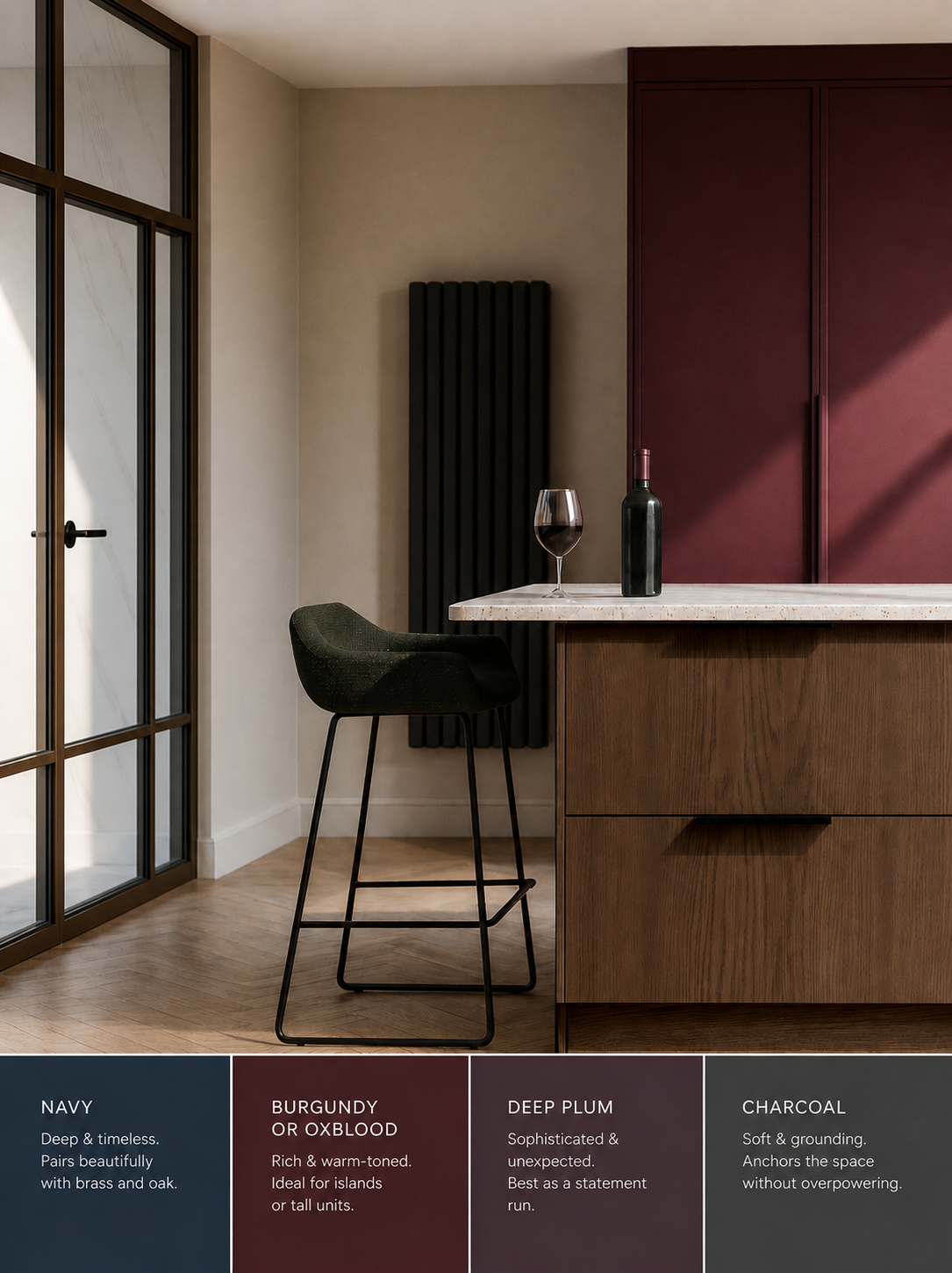
The pairing that makes dark colours work in 2026 is straightforward: deep navy and burgundy alongside warm timbers such as walnut, rather than cold stone or stainless steel.
The warmth of the material offsets the depth of the colour.
Tones worth considering for a statement element:
• Navy — the most reliable dark choice; pairs with brass, oak, and warm stone
• Burgundy or oxblood — rich and warm-toned, works on islands or tall units
• Deep plum — more unexpected, best used as a single statement run
• Charcoal — softer than black, anchors the space without dominating it
From my experience, the safest approach with any of these is to use the deep colour on lower cabinets or the island only, with lighter, warmer tones on upper units.
If you are considering a kitchen island in a contrasting tone, our guide on how to size a kitchen island properly covers the proportions that make this look right.
Two-Tone Kitchens: The Practical Trend That Is Now Standard
Two-tone kitchens — different colours on upper and lower cabinets — are no longer a trend. Houzz's 2026 Kitchen Trends Study confirms more homeowners are now contrasting upper and lower cabinets as a matter of course. The question in 2026 is not whether to do it, but how to balance the tones without creating visual noise.
The most successful combinations use one grounding colour (typically deeper, on the lower units) against a lighter, warmer tone above. Wall cabinets in a heavy dark colour tend to feel oppressive — keep depth low and allow the eye to rest upwards.
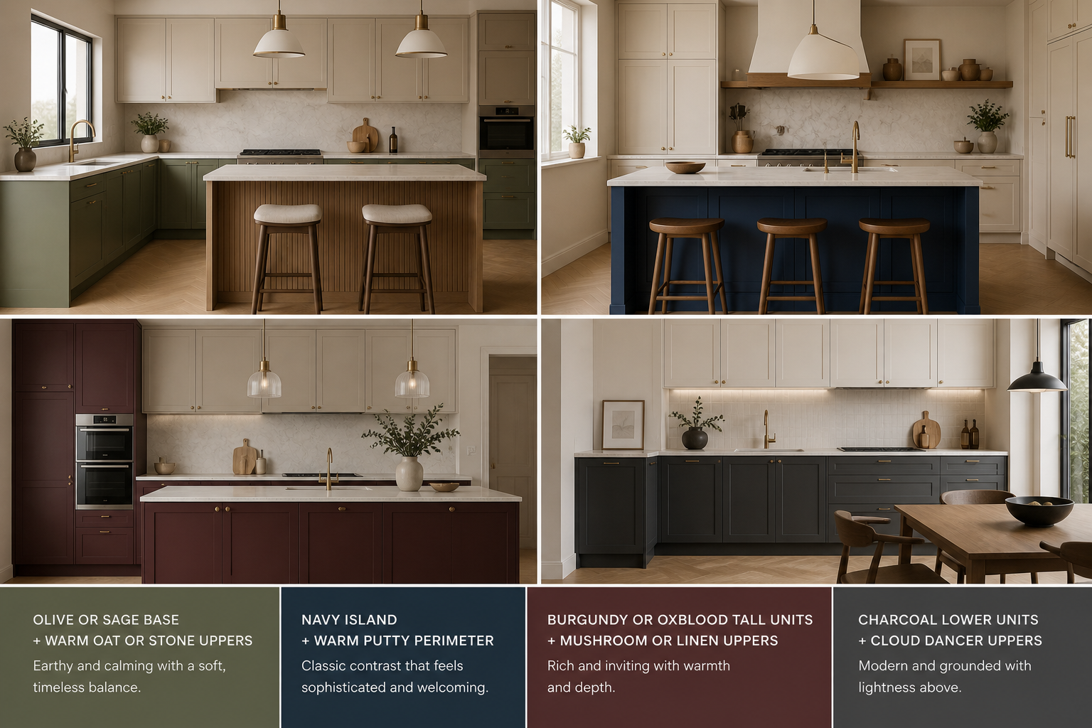
Combinations that are working well in 2026:
• Olive or sage base units + warm oat or stone uppers
• Navy island + warm putty perimeter cabinets
• Burgundy or oxblood tall units + mushroom or linen upper cabinets
• Charcoal lower cabinets + Cloud Dancer or warm white upper units
Howdens also notes the 60-30-10 rule as a useful guide: 60% dominant colour, 30% secondary, 10% accent — applied to cabinets, worktops, and hardware. It is a simple framework that prevents any single element from overwhelming the space.
Kitchen Colours Stepping Back in 2026
It is equally useful to know what to move away from, especially if your decision needs to last a decade.
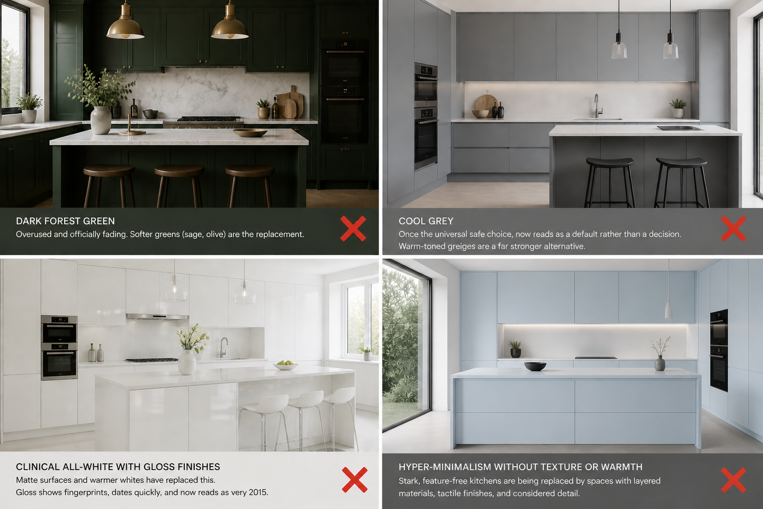
• Dark forest green. This was the defining kitchen colour of 2022–2024. Ideal Home confirms it is now overused and officially fading. Softer greens (sage, olive) are the replacement.
• Cool grey. Once the universal safe choice, now reads as a default rather than a decision. Warm-toned greiges are a far stronger alternative.
• Clinical all-white with gloss finishes. Matte surfaces and warmer whites have replaced this. Gloss shows fingerprints, dates quickly, and now reads as very 2015.
• Hyper-minimalism without texture or warmth. Stark, feature-free kitchens are being replaced by spaces with layered materials, tactile finishes, and considered detail — per the broader finding from Rehome's expert round-up.
How to Choose the Right Kitchen Colour for Your Home
Trend reports tell you what is popular. They do not tell you what is right for your specific kitchen. The correct colour depends on your lighting direction, layout, existing materials, and whether the kitchen opens into another room.
Key considerations before committing:
• Natural light direction — north-facing kitchens need warmth; cool tones amplify coldness in UK winter light
• Existing materials — stone floors, timber beams, or brick walls anchor your palette before a single cabinet is chosen. And that includes your worktop — which is one of the most dominant surfaces in any kitchen. If you're still deciding on material, our guide to the best kitchen worktop material UK covers every option with honest pros, cons, and budget recommendations.
• Open-plan connection — if the kitchen is visible from the living area, the colour must read well from both sides of the space
• Cabinet finish — matte is more forgiving and more current; gloss dates faster and shows every mark
• Lighting — warm neutrals and deep tones both depend heavily on lighting temperature; LED colour temperature should be decided alongside cabinet colour
For guidance on how kitchen layout and colour interact — particularly in open-plan homes — our article on which kitchen design is the most efficient covers how spatial decisions and colour choices are connected.
Frequently Asked Questions About Kitchen Colours 2026
What is the most popular kitchen colour in 2026?
According to reports from Howdens, John Lewis of Hungerford, and the NKBA, warm neutrals — particularly mushroom, taupe, oat, and stone tones — are the most widely adopted. Among statement colours, sage and olive green are transitioning from trend to timeless, while burgundy and navy are gaining ground for those wanting depth and character.
Is Pantone's 2026 Colour of the Year relevant to kitchens?
Yes. Pantone's 2026 Colour of the Year is Cloud Dancer — a soft, warm, airy white that is deliberately not stark or clinical. It points clearly towards the wider direction: warmth over cool, texture over gloss. It works well as a kitchen colour in its own right, or as the upper cabinet tone in a two-tone scheme.
Are white kitchens still in style in 2026?
Yes, but the tone has shifted decisively. Pure brilliant white and cool white are stepping back. Warm off-whites — linen, aged white, warm chalk, and Cloud Dancer-style tones — are the replacement. If you want a light kitchen, lean warm rather than pure white.
What kitchen colour adds the most value to a home?
There is no universal answer, but warm neutrals and classic deep tones (navy, olive, warm putty) tend to appeal to the widest range of buyers. Unusual or very trend-driven choices can divide opinion. Howdens' long-standing advice is that timeless neutrals combined with quality materials consistently outperform short-lived colour statements in terms of resale value.
Is dark forest green still a good kitchen choice in 2026?
It is more of a risk now than it was two years ago. Multiple designers and publications, including Ideal Home, identify dark forest green as overused and beginning to feel dated. Softer alternatives — olive, sage, and earthy greens — carry far less risk of dating while giving you the warmth and character that made green kitchens so popular in the first place.
Planning Your Kitchen Colour Scheme in Nottingham?
Colour is one part of the decision — and it works best when chosen alongside your layout, lighting plan, and materials. Getting the sequence right from the start saves cost and avoids changes that are expensive to reverse.
Tetiana at Alekseeva Design works with homeowners on kitchen and open-plan interior design — from full layout planning through to colour and material selection.
If you're planning a kitchen renovation in Nottingham, Derby, or anywhere across the East Midlands, we'd be glad to help.
The best kitchen colour is one that works with your light, your layout, and your life — not just the trend report.