Open-Plan Kitchen Extension in Birmingham
Extending and rethinking the kitchen of a Birmingham semi-detached home to create one generous, bright, open-plan kitchen-diner for cooking, dining, and gathering.
Project Overview
Location: Birmingham, UK
Property type: Semi-detached house
Project Scope: Kitchen Extension & Open-Plan Design
Project Stage: Completed May 2026
Services provided: concept design, spatial planning, lighting design, and material sourcing.
This project centred on a kitchen extension and a full layout reconfiguration for a semi-detached family home in Birmingham. The home had a separate dining area of around 12 sq.m leading through to a narrow 12 sq.m kitchen — two disconnected spaces that no longer suited the way the family lived. They wanted a larger, brighter space to enjoy cooking, room to host friends, and a layout that could grow with their family. By the time they came to me, they had already secured planning permission and had an architectural plan for the extension in place. My role was to take that approved footprint and design the kitchen within it — reconfiguring the two rooms into a single, open-plan kitchen-diner of approximately 40 sq.m, built around everyday family life.
Client Brief
The project was designed for a young family who wanted to bring their disconnected kitchen and dining areas together into one space that worked harder for daily life.
Their main goals were:
One connected, open-plan space that worked equally well for cooking, entertaining, and gathering
A kitchen island as the heart of the room — with seating and basic storage
Tall cabinetry for a clean, streamlined look and maximum storage
Plenty of worktop space for comfortable, everyday cooking
A range cooker is a key feature of the kitchen
Generous, well-planned storage throughout, keeping the space clutter-free
A small seating area within the kitchen — so that while one person cooks, others can sit, relax, and chat
A warm material palette using deep, rich colours
Controllable lighting, able to shift the mood and create different atmospheres for different occasions
One specific requirement was that the existing 2 x 1 m dining table had to stay — so the layout was designed around it. This became a key planning consideration: the new space needed to comfortably accommodate the table, the island, the seating area, and clear circulation, without the room feeling crowded.
The Starting Point
Before the redesign, the ground floor had two separate rooms:
Dining area: approx. 12 sq.m
Kitchen: approx. 12 sq.m
The two spaces sat one behind the other, with the dining area leading through to a narrow, enclosed kitchen at the rear. While the combined footprint was reasonable, the arrangement no longer suited a young, growing family.
Overall, the space felt:
disconnected — the kitchen was closed off from the dining area and the rest of the home
narrow and restrictive — the U-shaped kitchen was tight to work in, with limited worktop and storage
dark — the enclosed rear layout let in little natural light
unsociable — there was no room to sit, relax, or chat while cooking
inflexible — the layout couldn't comfortably support both everyday cooking and entertaining
For a semi-detached Birmingham home of this type, it's a familiar story: a rear kitchen that functions on its own terms but stays cut off from family life — fine for a previous era, but at odds with how families want to cook, eat, and gather today.
Key Challenges
Translating the brief into a working layout meant resolving several competing demands within a fixed footprint:
Unifying two separate rooms into one cohesive, open-plan kitchen-diner with a natural flow between cooking, dining, and seating zones
Designing within an approved footprint — the extension already had planning permission and architectural plans in place, so the internal layout had to make the most of a shell that was already fixed
Fitting a lot into one space — an island, range cooker, tall cabinetry, generous worktop and storage, a seating area, and the existing dining table all had to coexist without the room feeling crowded
Designing around the existing 2 x 1 m table as a fixed point, while still keeping clear, comfortable circulation around it
Bringing in natural light, replacing the dark, enclosed feel of the original kitchen
The Space Planning Solution
With the brief and constraints clear, the approach focused on more than simply enlarging the kitchen. The goal was to reconfigure how the entire ground-floor space worked — turning two separate, single-purpose rooms into one connected environment designed around cooking, dining, and family life.
Extending the Footprint
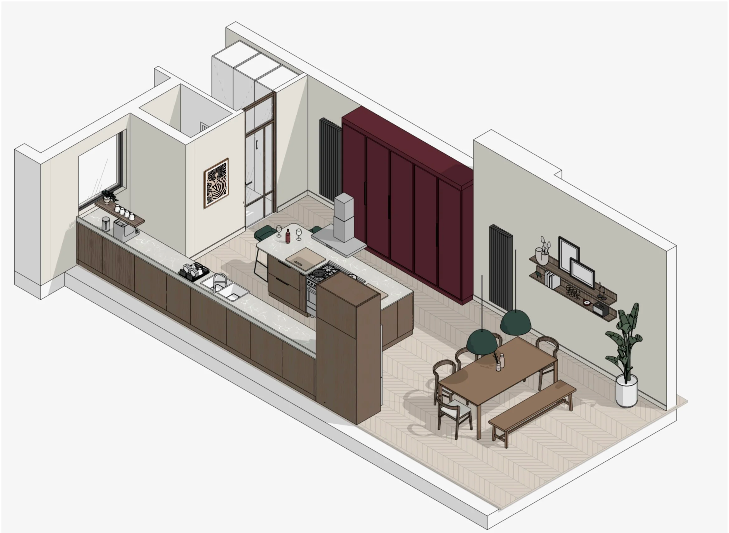
The two original rooms — a 12 sq.m dining area and a narrow 12 sq.m U-shaped kitchen — were combined and opened up into the new extension, creating a single open-plan kitchen-diner of approximately 40 sq.m.
This did two things at once. It added meaningful floor area, but just as importantly, it removed the wall and the front-to-back arrangement that had kept the kitchen dark and cut off. The result was a space with far better proportions — wide enough to hold an island, a dedicated cooking zone, the existing dining table, and a seating area, while keeping clear circulation throughout.
The extension came with its structure and glazing already resolved on the approved plans — a floor-to-ceiling glass panel, skylights over the main kitchen area, and a retained window through to the lounge. My role was to design the interior around this generous light: positioning the kitchen, island, and seating to make the most of where the daylight fell, and ensuring the bright, open feel the family wanted carried through the whole layout.
Zoning the Space
The new room is long and narrow — roughly 4.2 m wide and over 10 m deep — so the layout was planned as a clear sequence of zones, each with its own purpose but reading as one connected space.
The kitchen sits at the entrance. As you step into the space, you arrive in the working kitchen — practical and immediate, with the sink, appliances, storage, and a dedicated coffee station to one side, and a full run of tall cabinets opposite for maximum storage.
The island anchors the centre. Positioned at the heart of the room, it was always intended as the highlight of the kitchen — both visually and functionally. The gas range cooker is built into it, with seating for two on the far side, putting cooking literally at the centre of the space and keeping the cook facing out toward the family rather than turned to a wall.
The main cooking and working zone runs along the wall, where it benefits from the best natural light — the skylights above the extension flood this part of the room with bright, natural daylight, making it a genuinely pleasant place to cook.
A small seating area sits between the kitchen and dining zones. This was a specific request: the client wanted a spot where family members could sit, relax, and stay connected with whoever was cooking. A freestanding sofa makes this a genuinely comfortable place to settle, bridging the two ends of the room and keeping everyone together — exactly as the brief intended.
The dining area sits at the very end of the extension, framed by the floor-to-ceiling glazing. This gave it the strongest connection to the outdoors and the most generous natural light — a bright, open spot for family meals that feels linked to the garden beyond. The family's existing dining table anchors the zone, paired with a freestanding bench for flexible, sociable seating.
The result is a layout that flows naturally from practical to social as you move through it — kitchen, to island, to seating, to dining — with the island holding it all together as the central highlight.
Designing the Kitchen Layout
With the zones set, the working kitchen itself was designed for efficiency — everything within easy reach, with generous worktop space and a clear flow between preparing, cooking, and cleaning up.
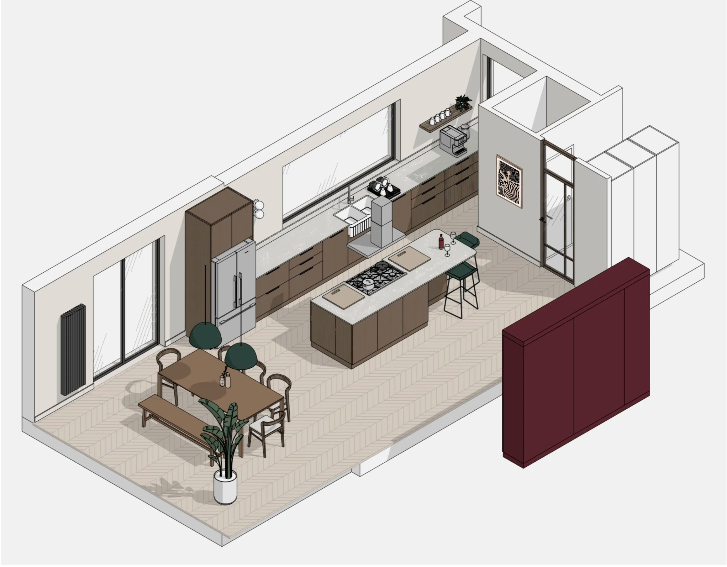
The kitchen runs along two facing walls with the island between them, giving three working surfaces rather than one cramped run, and keeping the busiest parts of the kitchen close together without crowding.
One wall handles prep and clean-up. A double-bowl sink sits centred beneath the window — a brighter, more pleasant spot to work, with a view out while washing up — and an integrated washing machine sits within the same run, concealed behind a cabinet front to keep the look clean. The fridge-freezer anchors the far end. At the top of this wall, nearest the entrance, a dedicated coffee station with a floating shelf gives the family a small everyday ritual its own defined spot — out of the main cooking flow, so making coffee never clashes with cooking.
The opposite wall is given over to storage. A continuous 3 m run of tall cabinets delivers the maximum storage the brief called for, housing provisions, appliances, and everyday clutter behind clean, full-height fronts — the streamlined look the client wanted.
The island is the working centrepiece. The gas range cooker is built into it, with prep space to either side and seating for two on the far side. Positioning the cooker here means the main work surface looks out across the room, and it sits naturally between the sink on one wall and the fridge on the other — a compact, comfortable working triangle despite the room's length.
Towards the rear, a new ground-floor WC and additional storage make practical use of the space nearest the house, keeping the main kitchen-diner clear for cooking and family life.
The result is a kitchen that holds a lot — sink, range, full appliance set, generous storage, and a coffee station — without ever feeling busy, because each function has a clearly defined place.
A Range Cooker at the Heart of the Island
Putting the range cooker on the island was the client's clearest wish — and the detail the whole design plays around. It makes cooking the centre of the room rather than something done facing a wall, and gives the family a real focal point.
The challenge was extraction. Ducting the extractor to the outside would have meant routing through two structural ceiling beams, which simply wasn't feasible. Rather than compromise on the island cooker, the hood type was changed to suit: a T-shaped island hood mounted above the cooker, run as a recirculating unit. Instead of venting outside, it draws steam and odours through built-in filters and returns the cleaned air to the room — no ducting through the structure required.
Positioned over the island, the hood does double duty. It resolved the structural constraint, but it also became a design feature in its own right — anchoring and framing the cooking zone, and giving the centre of the open-plan space a strong vertical focal point above the range.
Storage Solutions
Generous, well-planned storage was central to the brief — the family wanted everything to have its place, keeping the open-plan space calm and clutter-free rather than busy. With the room on show from every angle, storage had to do a lot of work while staying almost invisible.
The tall-cabinet wall does the heavy lifting. A continuous 3 m run of full-height cabinets lines one side of the kitchen, swallowing provisions, everyday items, and appliances behind clean, floor-to-ceiling fronts. Concentrating storage into one uninterrupted wall keeps the rest of the room visually quiet and means nothing has to spill out onto the worktops.
Appliances are integrated, not on display. The washing machine sits concealed within the kitchen run behind a matching cabinet front, and appliances are built in throughout — so the space reads as a calm, considered kitchen rather than a utility area, even though it's working hard.
The island adds discreet storage at the centre. Beyond housing the range cooker and seating, the island provides additional everyday storage exactly where it's needed — close to the main prep and cooking zone.
A dedicated coffee station keeps daily clutter contained. With its own floating shelf and defined spot near the entrance, it gives the small, everyday items — mugs, machine, essentials — a home of their own, off the main worktops.
The result is a kitchen that holds everything a busy young family needs, without ever looking like it does — exactly the clean, uncluttered space the brief called for.
Designing Around the Dining Table
One fixed point shaped the whole dining zone: the family's existing dining table, measuring 2 x 1 m, had to stay. Rather than treat it as a limitation, it became the anchor the rest of the space was planned around.
At 2 m long, the table needed proper room — not just to seat the family, but to allow comfortable circulation on every side so no one is squeezed past while others are seated. Placing it at the very end of the extension, framed by the floor-to-ceiling glazing, gave it the space and the setting to work: the brightest part of the room, with a direct connection to the garden beyond.
The table is paired with a freestanding bench along one side — a flexible, sociable choice that seats more people in less space than individual chairs, and can be pulled in or moved aside as needed. It suits a young, growing family: easy for children, easy to add to, and informal in feel.
Keeping the existing table also kept something the family already valued, rather than replacing it for the sake of a fresh scheme. The design works with it — positioning, lighting, and circulation all planned around its footprint — so it feels intentional and at home in the new space rather than carried over from the old one.
Circulation & Flow
In a long, narrow room, circulation is everything — get it wrong and an open-plan space feels like a corridor you pass through rather than a room you live in. So movement was planned from the outset, not left to fall around the furniture.
The space reads as a natural journey from front to back: you enter into the working kitchen, move past the central island, through the seating area, and arrive at the dining zone by the glazing. Each zone flows into the next, so the room feels generous and connected along its full length rather than broken into separate boxes.
The island is key to making this work. By sitting centrally, it keeps the busy kitchen and the relaxed living and dining zones clearly apart, while still allowing easy movement around all sides. Cooking traffic stays in the kitchen end; family and guests can settle in the seating and dining areas without ever crossing the cook's path.
Crucially, the layout keeps the cook connected, not isolated. With the range cooker on the island facing into the room, whoever is cooking stays part of the conversation — able to talk to family in the seating area or guests at the table — which was exactly the sociable, together feeling the client asked for.
The result is a space that moves easily: clear routes through, no pinch points, and a natural rhythm from practical to relaxed as you travel through the room.
Design Development
Material & Colour Palette
The brief called for a warm palette built on deep, rich colours — a kitchen that felt welcoming and characterful, not cold or clinical. The scheme answers that directly, layering warm woods and saturated tones against a light, calm backdrop.
Morello cherry and dark oak lead the palette. The rich, deep morello cherry brings warmth and personality — a confident colour that gives the kitchen its identity — while dark oak texture adds natural depth and grain alongside it. Together they form the heart of the scheme, anchoring the space with warmth and a sense of quality.
Light shades keep the backdrop calm. Set against the richer accents, lighter tones open the space up and let in the natural light from the glazing and skylights, stopping the deep colours from feeling heavy. The result is balance — warmth and depth where it counts, lightness and air everywhere else.
Forest green adds a secondary accent in the details. Used more sparingly, it brings a quieter, grounding note that complements the warmth of the cherry and dark oak — a considered layer that rewards a second look rather than competing for attention.
The palette as a whole feels deliberately layered: rich and warm at its core, light and open in its setting, with just enough green to give it depth. It's a scheme with personality that still feels timeless — exactly the warm, inviting space the family wanted.
Worktops & Surfaces
With a bold, warm colour palette doing the visual work, the surfaces were chosen to be hard-working first — practical enough for a busy young family, and balanced carefully against budget.
Worktops were specified in quartz, chosen for its durability, hygienic surface, and low maintenance — the right call for a kitchen in daily use for cooking and entertaining. The palette was kept deliberately neutral, both to let the cherry and dark oak stay the focus and to keep the specification within budget. That mattered here: with a long run of cabinetry, particularly along the main kitchen unit, the worktop covered significant lengths, so a sensible material choice kept costs in check without compromising on quality or durability.
Rather than a tiled splashback, a simple upstand runs behind the main kitchen unit — enough to protect the wall and keep the surface practical to clean, while maintaining the calm, uncluttered look. It's a quieter, more streamlined choice that suits the pared-back backdrop.
The flooring is a neutral oak texture in a lighter tone — deliberately lighter than the cabinetry. This was a considered contrast: a light floor bounces more natural light around the open-plan space, keeping it bright, while making the deeper dark oak and morello cherry of the cabinetry stand out all the more. Running as one continuous surface across the whole room, it also ties the zones together and keeps the long space feeling unified rather than divided.
The surfaces were selected to work hard, sit comfortably within budget, and quietly support the palette — letting the richer cabinetry colours take centre stage against a calm, light base.
Lighting Strategy
Lighting was central to the brief: the client wanted to be able to control the mood and create different atmospheres for different occasions — bright and practical for cooking, softer and warmer for relaxing or entertaining. The strategy layers several types of lighting so the room can shift easily between those moods.
Adjustable spotlights form the main ceiling layer. Double spotlights with adjustable heads let the light be directed exactly where it's needed — onto worktops and key working zones for cooking, or angled toward features and architectural details to highlight them. Being directional, they give flexibility a fixed downlight never could, putting light precisely where it earns its place.
Pendant lighting defines the dining zone. A line of pendants hangs above the dining table, picked out in forest green to tie back to the palette's secondary accent. As well as lighting the table, they visually anchor the dining area and give it a sense of its own — a warmer, more intimate pool of light at the social end of the room.
A wall spotlight highlights the sink area. A dedicated wall light over the sink keeps that zone usable and softly lit after dark, without needing the full ceiling lighting on — useful for early mornings and late evenings, and a gentle accent in its own right.
Smart bulbs tie it all together. The client chose smart bulbs throughout, easily controlled from a phone or by voice. This makes the whole multi-layered scheme genuinely effortless to use — dimming, switching zones, and changing the atmosphere of the room at a word or a tap, exactly the everyday control the brief asked for.
The Finished Space
The finished kitchen-diner is everything the family set out for: spacious, comfortable, and full of light and air. The transformation from two dark, disconnected rooms into one bright, open space is complete — and it's immediately felt the moment you step in.
The sense of space is striking. The high ceiling over the dining area gives the room a genuine feeling of openness and volume, while the floor-to-ceiling glazing and skylights fill it with natural light throughout the day. After the dark, enclosed kitchen the family started with, the contrast is dramatic — light now reaches every corner.
Just as importantly, the space simply works. Movement through it is intuitive — kitchen, to island, to seating, to dining — with no awkward routes or wasted space. Everything is balanced: the working kitchen, the sociable island, the relaxed seating area, and the bright dining zone each have their place, and together they make one connected room that suits the whole family.
It's a space designed around real family life — cooking, entertaining, and gathering — and it delivers on all three. Warm and characterful thanks to the morello cherry and dark oak palette, calm and light thanks to its neutral backdrop and generous glazing, it's a kitchen-diner the family can genuinely live in.
What the Client Said
“We used Tetiana for our kitchen design and she was honestly the best part of our whole extension process. She's incredibly friendly and open – from day one we felt comfortable and listened to, she was engaged and proactive. She went out of her way to provide multiple options at every stage, showing us ideas we may never have thought of ourselves. What really stood out was how she asked all the right questions. She guided us to figure out exactly what we wanted and needed from our new space. Without Tetiana we would not have got the kitchen we have now, and we are so happy with it. The space is beautiful and practical. We would highly recommend her to anyone!”
— Mindy and Louise H., Birmingham
Thinking About Your Own Kitchen Extension?
If you're planning a kitchen extension or open-plan project — whether you've already got planning permission and architectural plans in place, or you're just starting to imagine what's possible — thoughtful interior design is what turns an approved footprint into a space that genuinely works for your family.
From space planning and layout to materials, lighting, and the finishing details, I help homeowners across Birmingham and the Midlands create kitchens that are as practical as they are beautiful.
Explore Kitchen & Open-Plan Interior Design Service
Based in South Derbyshire and working throughout Birmingham, Solihull, Sutton Coldfield, and the surrounding areas.